SportFit is a local gym brand aiming to establish a strong online presence to attract new members and showcase its state-of-the-art facilities. The objective was to create an engaging, easy-to-navigate, and motivating digital platform that aligns with the energetic and bold personality of a fitness brand.
The client didn’t have an existing website and was facing difficulties in:
Converting walk-in leads to long-term memberships.
Showcasing available services and training packages.
Offering easy class booking and inquiry systems.
Building a digital presence in a competitive fitness market.
The Goal
Design a bold, modern, and energetic user interface.
Ensure intuitive navigation across devices.
Highlight key offerings
Build credibility with testimonials and trainer profiles.
Project Scope
SportFit- High Performance Center
Tool Used
Figma
Role
UX designer designing a chat support desktop screen for a web app from conception to delivery.
Duration
December 2024 to January 2025
Understanding the user
Research and Understanding
Interviews: Interviews with gym clients and trainers.
User Persona Development: I created detailed personas representing both a gym trainer and a client to better understand user needs and guide the design process effectively.
Competitor Analysis: Studied existing gym websites to understand strengths and gaps.
Research and Understanding
Persona
Problem statement
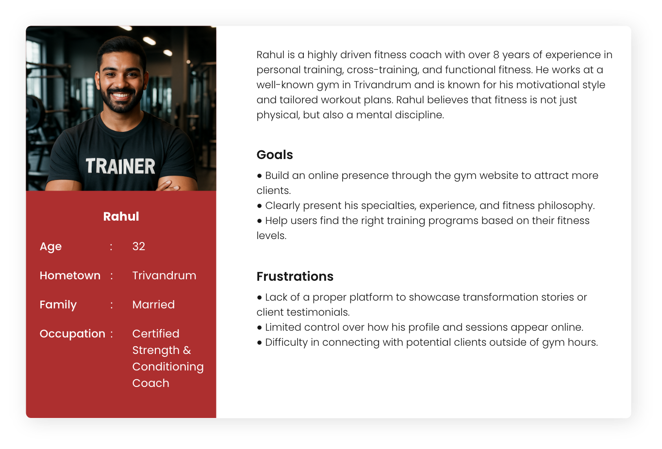
Persona : Rahul
Problem statement: Rahul, an experienced fitness coach, lacks a dedicated digital platform to showcase his expertise, client results, and connect with potential clients outside gym hours, limiting his professional growth and online reach.
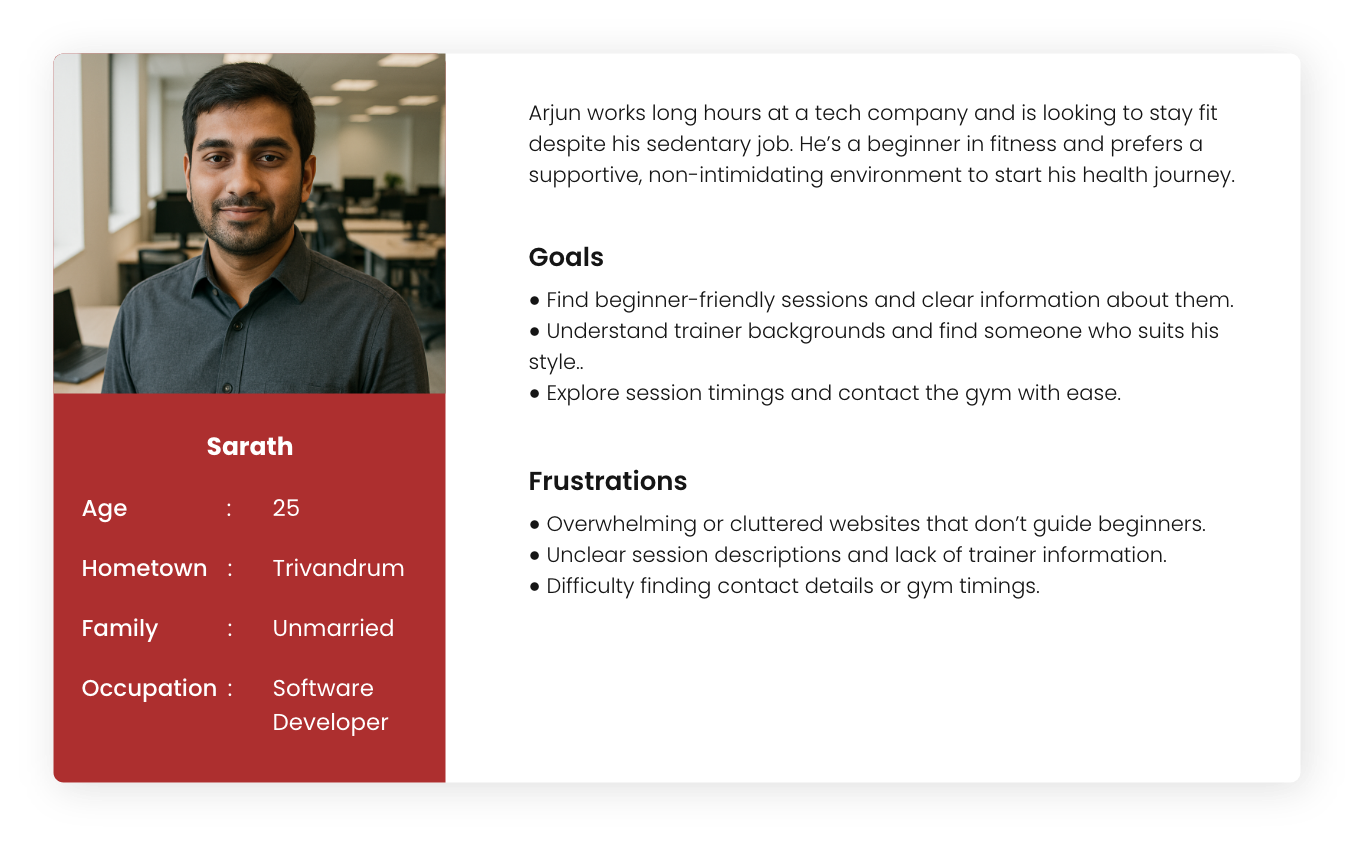
Persona : Sarath
Problem statement: Sarath, a 25-year-old software developer from Trivandrum, wants to start his fitness journey but feels overwhelmed. Most gym websites are cluttered and lack clear info for beginners. He just wants a simple, welcoming way to understand sessions, trainers, and how to get started.
Starting the design
Paper wireframes
Digital Wireframes
Low Fidelity Prototypes
Key features
Usability studies
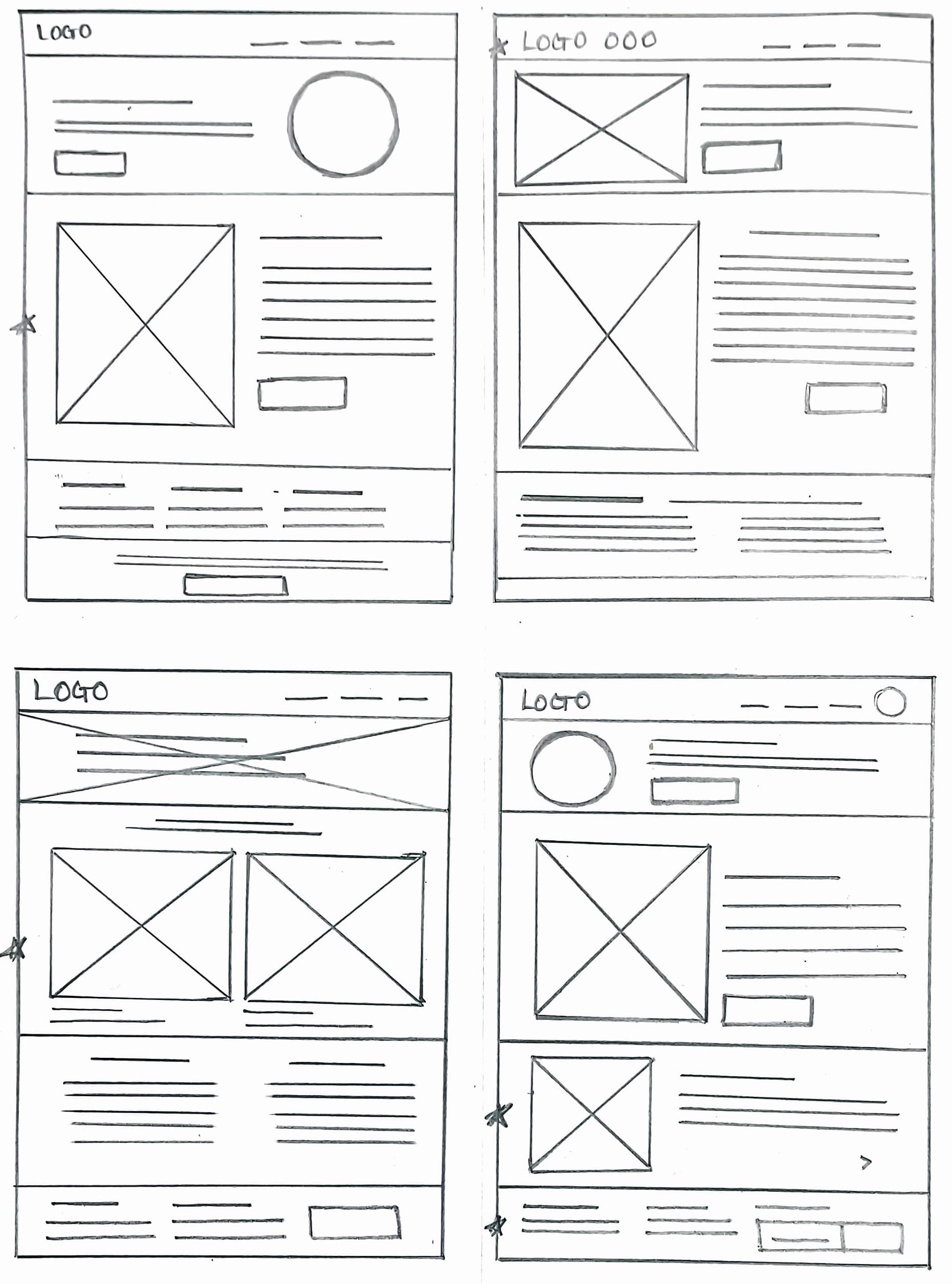
Paper wireframes
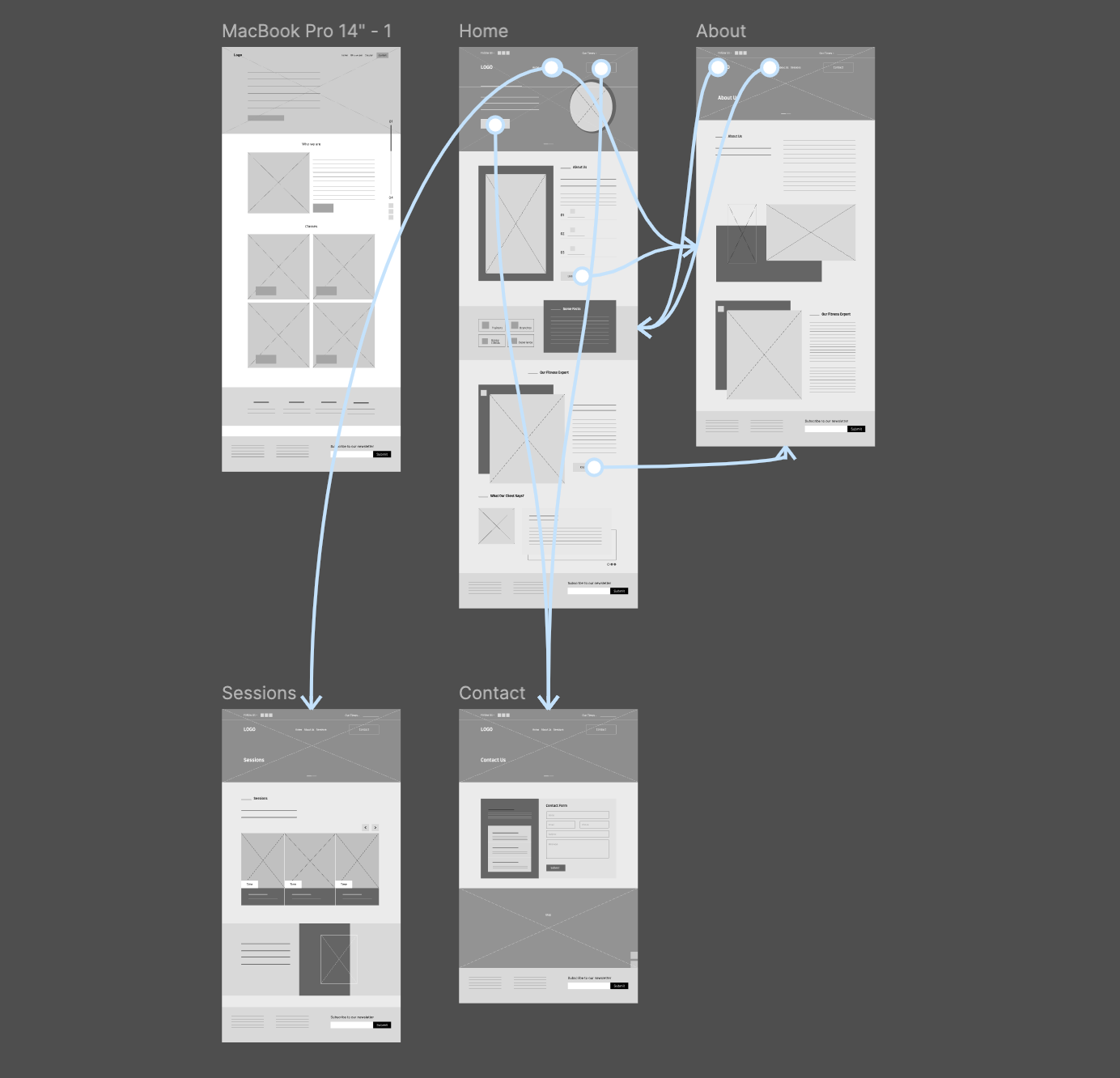
Initial sketches were created to explore layout ideas and user flow quickly. These low-fidelity wireframes helped in visualizing the structure, organizing content, and making fast decisions before moving to digital design.
Paper wireframes
Digital Wireframes
Low Fidelity Prototypes
Key features
Usability studies
Star is used to mark elements added in the final design.
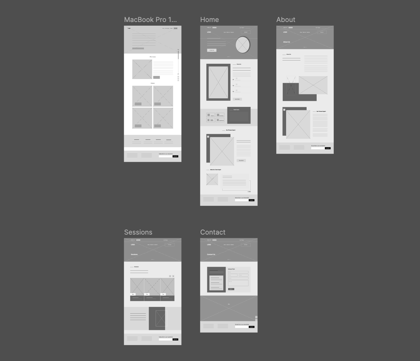
Digital wireframes
Digital wireframes were created to map out the layout and structure of the interface with clarity and precision. These wireframes focused on functionality and user flow, serving as a blueprint before adding visual design elements.
Low-Fidelity Prototype
The low-fidelity prototype focused on demonstrating the basic structure and core functionality of the design. It allowed for quick testing of user flow and interactions without detailed visuals, helping identify major usability issues early.
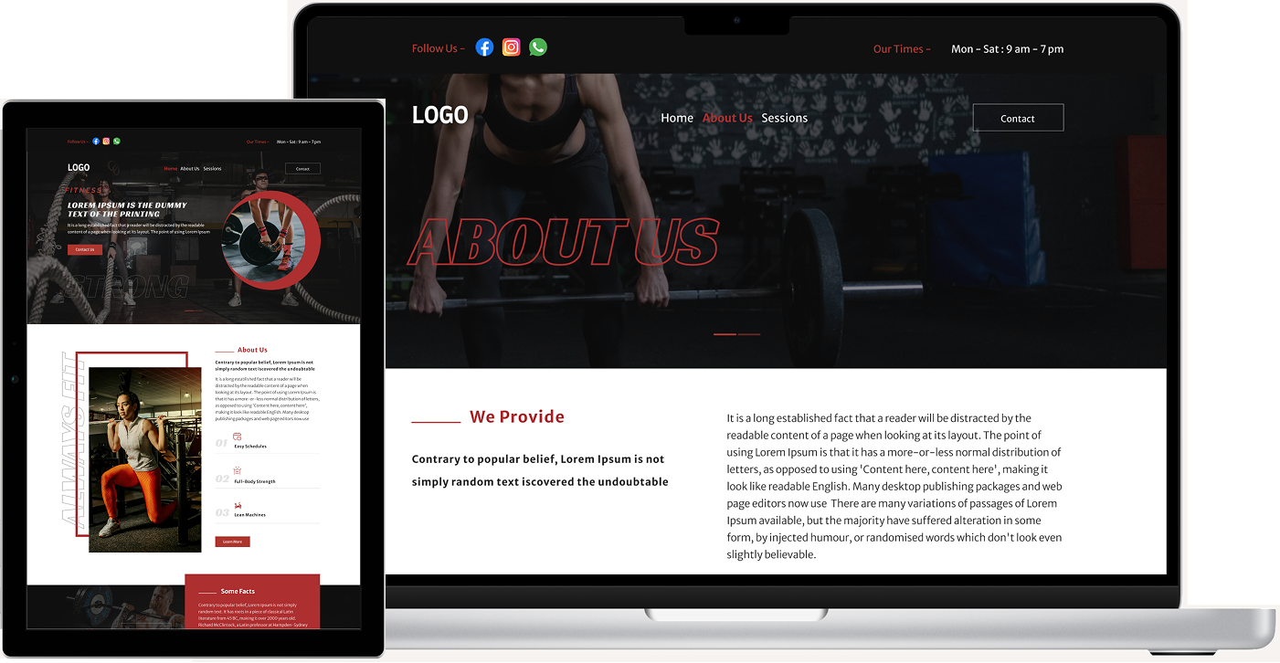
Visually powerful hero section featuring real gym imagery.
Motivational taglines with a strong call-to-action like “Start Your Fitness Journey Today.”
Trainer Profiles
Individual profile cards for trainers with photos, experience, and specialization.
“Book a Session” or “Know More” buttons to increase engagement.
Testimonials Section
User-generated reviews displayed in a carousel format.
Builds trust and encourages new users to join.
Contact & Location Integration
Integrated Google Maps for gym location.
Easy access to contact info, working hours, and social media links.
Usability Studies
Methodology
Tested with three participants who matched the target audience of fitness enthusiasts and regular gym-goers.
Tasks included exploring workout session schedules, checking trainer profiles, and booking a trial session.
Feedback
Positive: Users found the website visually motivating and appreciated the easy navigation across key sections.
Improvements: The contact page was enhanced by adding an embedded map to make it easier for users to locate the gym and get in touch quickly.
Final Design
UI Design
High- Fidelity Prototype
Mockups
Accessibility
UI Design
A clean, energetic interface designed to inspire users and ensure ease of use.
Sections are logically grouped to help users effortlessly browse sessions, trainer details, and gym facilities.
Color Palette: Used a bold and motivating color scheme reflecting the gym’s branding and fitness vibe.
Typography: Chose strong, modern fonts that are easy to read and align with the active theme.
Icons: Integrated clear, action-based icons for exploring sessions, viewing trainers, and accessing contact information.
UI Design
High- Fidelity Prototype
Mockups
Accessibility
High- Fidelity Prototype
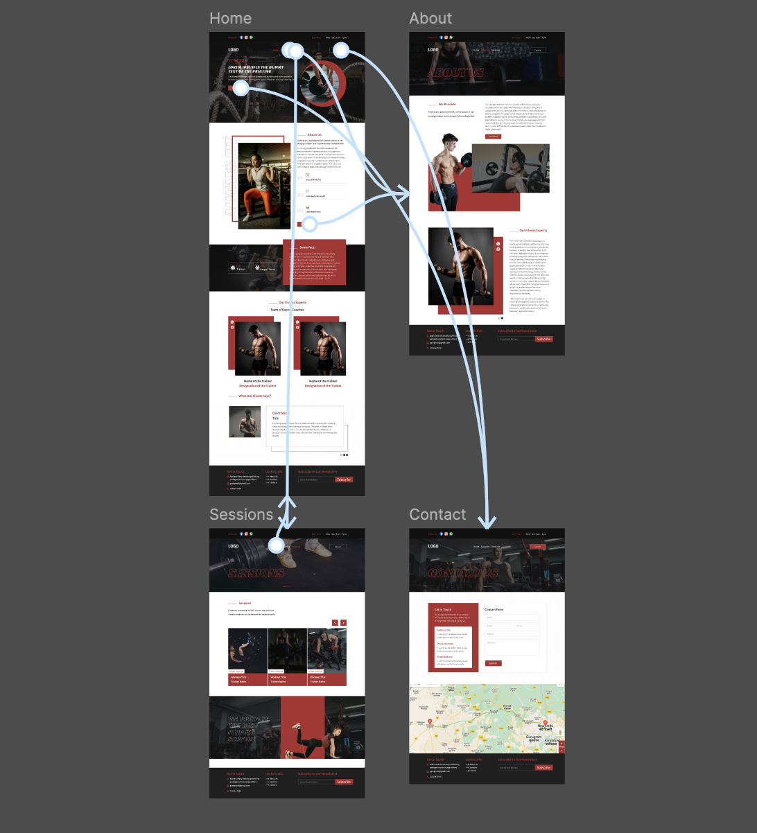
The high-fidelity prototype provided an interactive and visually detailed experience, closely resembling the final product. It was used to validate design decisions, gather user feedback on visual and interactive elements, and prepare for development handoff.
Mockups showcase the polished visual design, combining layout, branding, and UI elements to present a realistic view of the final product. They were used to communicate the design vision and ensure visual consistency across all screens.
Accessibility considerations
Used clear and familiar icons to simplify navigation and enhance usability across all devices.
The website features a straightforward navigation structure with all interactive elements.
Going forward
Takeaways
Next steps
Takeaways
Takeaways
Next steps
Impact
Design should not only look energetic but also be inclusive and user-friendly for all fitness levels and user types. Small changes in accessibility and layout clarity significantly improve user engagement.
What I learned
The project involved structuring clear, goal-focused layouts while maintaining a strong visual appeal. Design iterations highlighted how layout adjustments and CTA placements can improve user flow and interaction.
Next steps
Conduct another round of usability studies to validate whether the pain points users experienced have been effectively addressed.
Conduct more user research to determine any new areas of need.